Sharing is caring!
As a mompreneur, it’s essential to create a thriving online business that fits your lifestyle and resonates with your target audience. One crucial aspect of this process is optimizing your checkout pages to maximize conversions.
A high-converting checkout page ensures a seamless and pleasant experience for your customers, leading to increased sales and returning customers. That means more business growth.
In this blog post, we’ll explore easy to implement tips to help you create checkout pages that convert visitors into paying customers.
AFFILIATE DISCLAIMER: I SOMETIMES LINK TO PRODUCTS AND SERVICES TO HELP COVER THE COSTS OF RUNNING THIS BLOG. THERE’S NO EXTRA COST TO YOU – AND I ONLY RECOMMEND PRODUCTS THAT I’VE BOTH USED PERSONALLY AND THINK ARE QUALITY PRODUCTS THAT HELP WITH EFFICIENCY. PLEASE READ MY AFFILIATE DISCLOSURE FOR MORE INFORMATION. THANKS FOR YOUR SUPPORT!
Table of Contents
- What is a checkout page conversion?
- What is a good conversion rate for a checkout page?
- How do I increase checkout page conversions?
- Increase Checkout Conversions
What is a checkout page conversion?
A checkout conversion is the percentage of customers that make a purchase after landing on your checkout page versus those that leave without completing a purchase.
So, if you want to manually do the math. You’ll take completed purchases divided by the number of total visitors, and you’ll have your checkout page conversion rate.
What is a good conversion rate for a checkout page?
So what is a good conversion rate for your checkout page? To be honest, conversion rates vary by industry. It can be hard to give you a solid number because it can be misleading. Sometimes I think it makes people feel like they aren’t doing enough.
So take these numbers into account, but don’t dwell on them or beat yourself up if you aren’t close to these percentages, yet. You’ll get there!
But, overall a good conversion rate is considered 10%. But the average conversion rate is between 2-5% for all advertisers. To get an even clearer picture, checkout this article from WebFX.
They go into detail more about conversion rates. It’ll help you set an attainable goal for your own business.
Related Article: Unlock the Power of Thrivecart Pro Plus Convertbox
How do I increase checkout page conversions?
So now you know what a checkout conversion rate is and have a better idea of what you should strive for on your own checkout pages. But how can you increase checkout page conversions? How can you get more people to buy from you, so you have fewer abandoned carts?
Here are 8 simple, but so effective, tips to increase your checkout page conversions:
1. Keep it Simple
The first rule of a high-converting checkout page is to keep it simple. Don’t overwhelm your customers with too many fields or options. Stick to the essentials, such as name, address, and payment information.
Additionally, make sure your checkout page is easy to navigate. Use clear and concise language, and guide your customers through the process with clear calls-to-action.
2. Clearly Display Pricing and Product Information
Ensure that your customers have a clear understanding of the pricing details and product information on the checkout page. Display the total cost, itemized pricing if applicable, and any additional fees or taxes. Transparency builds trust and helps customers make informed purchasing decisions.
3. Offer Multiple Payment Options
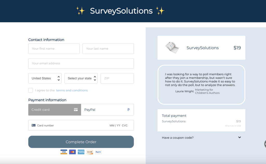
Offering multiple payment options can help increase your conversion rates. Some customers prefer to pay with credit cards, while others may prefer PayPal or other payment processors. By offering multiple options, you can cater to a wider range of customers and increase the likelihood of completing a sale.
4. Optimize for Mobile Devices:
With the increasing use of smartphones and tablets for online shopping, optimizing your checkout pages for mobile devices is crucial. Make sure your page is mobile-responsive, loads quickly, and is easy to navigate on smaller screens. Simplify the form-filling process by utilizing auto-fill features and minimizing typing requirements.
5. Provide Clear Delivery Information
Customers want to know when they can expect to receive their order. Make sure to provide clear and accurate delivery information on your checkout page. Will they receive their digital download immediately? Will instructions for their 1:1 consultation be emailed to them? Where can they expect to hear from you, and how long should they expect to wait. This can help reduce cart abandonment and increase overall customer satisfaction.
6. Show Social Proof
With increasing numbers of online businesses and online buyers, social proof has become not only necessary but the norm. According to SproutSocial, “95% of shoppers read reviews before making a purchase.” 95%! That shows just how important social proof is to buyers, and how it helps to give your brand more authority and trust. So take care of each and every buyer, so they have a good experience with your business. And don’t forget to get a review or testimonial.
7. Offer a Refund Policy
Buying online can be scary. Give your customers peace of mind with a solid refund policy. One that let’s them know how they can get their money back if your product just isn’t the right fit. But also a refund policy that protects your business from unethical buyers wanting your knowledge without actually paying. This is especially true for digital product sellers.
Protect your customers’ peace of mind and your own business. If you’re not sure how to do this, check out The Contract Shop’s Refund Recon. It has everything you need to set up a refund policy, and keep your business protected.

8. Use Trust Seals and Security Badges
Customers want to feel secure when making online purchases. By using trust seals and security badges on your checkout page, you can help reassure customers that their information is safe and secure. This can help increase trust and confidence in your brand, leading to more sales.
Trust seals and badges are included with Thrivecart checkout pages, including refund guarantee badges, Secure SSL encryption badge, trusted seller, and more. Learn more about the easiest, most cost-effective cart solution for digital product and online course sellers: Thrivecart.
Related Article: Crafting Target Audience Survey Questions for Maximum Insight
Increase Checkout Conversions
By following these checkout page conversion tips, you can create a high-converting checkout page that helps boost your sales and improve customer satisfaction.
Remember, the checkout process is a critical step in the customer journey. Make sure to invest the time and resources needed to create a checkout page that actually converts.
And, don’t forget to test and optimize your checkout page regularly. Analyze your conversion rates. Make adjustments as needed. This can help ensure that your checkout page continues to perform at its best.
So what are you waiting for? Start optimizing your checkout page today and watch your sales soar!
Want more online marketing help? Check out these recent articles:
- Evergreen Content Strategy: Evergreen vs Seasonal Content (Which Should You Use?)
- Why Content Creation Feels Hard (And What to Fix First)
- Content Marketing vs. Content Strategy: What’s the Difference (and Why It Matters)
- Content Strategy Template: Free Download
- 10 SEO Myths That Are Secretly Hurting Your Website Traffic
What is checkout conversion?
A checkout conversion is the percentage of customers that make a purchase after landing on your checkout page versus those that leave without completing a purchase.
How do I increase checkout page conversion?
To increase checkout page conversion, you need to make things as clear as possible for your buyers. Be transparent in what they’ll get when they buy, how much it’ll cost in total, and always work to provide the best customer service through out the entire buying process and beyond. Plus, follow these 8 checkout page conversion tips.
What is a good conversion rate for a checkout page?
To be honest, conversion rates vary by industry. It can be hard to give you a hard number because it can be misleading and make you feel like you aren’t doing enough. But, a good conversion rate is considered 10%. But the average conversion rate is between 2-5% for all advertisers.
What is a checkout process in conversion?
The checkout process is a process or path a potential buyer goes through before hitting that complete order button and completing a purchase. This process includes the checkout page, viewing products in their cart, and filling out any payment information.
+ show Comments
- Hide Comments
add a comment