Are you thinking of building a website? The most critical decision is choosing the right platform. Because choosing wrong will cost not only money, but a lot of time. So let’s save you from unnecessary costs and frustrations. In this article, we’ll compare Showit Vs. Squarespace. We’ll look at ease of use, design and customization, online selling capabilities, and SEO and marketing tools. By the end of the article, you’ll be able to effortlessly pick the website platform that fits you and your business best. And if you can’t, feel free to drop your comments, and I’ll personally help you decide. Let’s get started.
AFFILIATE DISCLAIMER: I SOMETIMES LINK TO PRODUCTS AND SERVICES TO HELP COVER THE COSTS OF RUNNING THIS BLOG. THERE’S NO EXTRA COST TO YOU – AND I ONLY RECOMMEND PRODUCTS THAT I’VE BOTH USED PERSONALLY AND THINK ARE QUALITY PRODUCTS THAT HELP WITH EFFICIENCY. PLEASE READ MY AFFILIATE DISCLOSURE FOR MORE INFORMATION. THANKS FOR YOUR SUPPORT!
Table of Contents
- Showit Vs Squarespace: Which platform is best for you?
- Ease of Use
- Design and Customization
- Online Selling Capabilities
- SEO and Marketing Tools
- Showit Vs Squarespace: The Final Verdict
Showit Vs Squarespace: Which platform is best for you?
Showit and Squarespace are two of the most popular website builders available today. They’re ideal for anyone who wants to create a professional website without any coding knowledge. Both platforms offer user-friendly interfaces and drag-and-drop functionality. In this article, we will compare the two platforms to help you make an informed decision about which one to choose.

What is Showit?
Showit is a drag-and-drop style website builder. And this simply means you can easily create a website without any coding knowledge. You can drag and drop images, color blocks, text, and more.
Showit allows you to customize your colors, edit your template as you see fit, and even add new designs easily.
I think, one of the best things about Showit is that it allows you to incorporate a WordPress blog. So you get the best of both worlds. A WordPress blog for powerful SEO when blogging, but still have the ease and efficiency of a website template. With Showit, you can create a website that is both beautiful and functional.
Another favorite of mine about Showit is that it offers a variety of templates to choose from. You can purchase directly from Showit, or find a Showit partner who creates pre-made website templates for you to choose from.
I also think Showit’s customer support is top-notch. Which is always a plus with anything tech-related.
Even when you’re a brand new website and setting everything up, they’re so helpful! You don’t need to be a big name or high-dollar client. They’re there to help whenever you need.
I’ve only had to use their support twice, and once was to upgrade to the highest blogging tier, and they were very quick with their responses both times.
The best part, their support is all right inside of your Showit account. You simply send them a chat, and they’ll get back to you. You can even keep working on your website while you wait.
What is Squarespace?
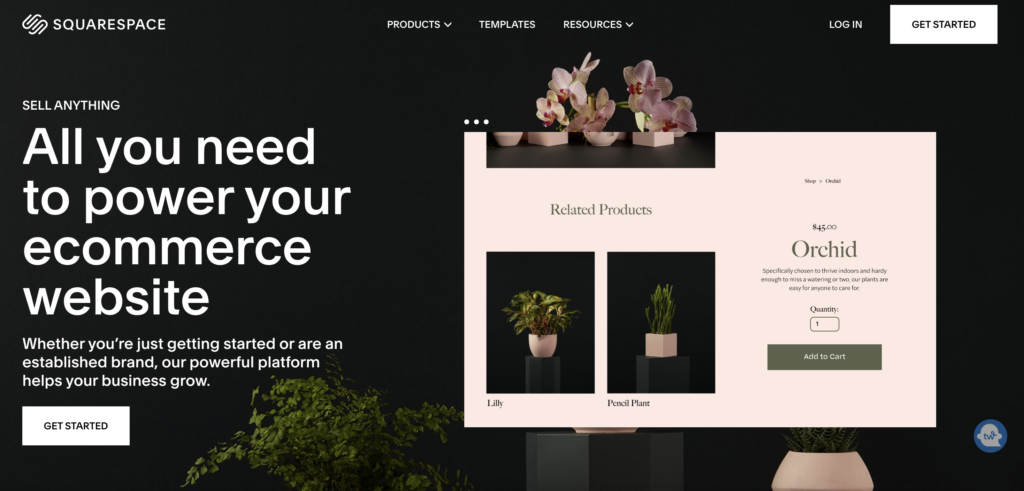
Squarespace is an all-in-one platform for building a website. Like Showit, Squarespace offers drag-and-drop functionality, which makes it easy to create a website without any coding knowledge. One of the things that sets Squarespace apart from other website builders is its e-commerce capabilities.
Squarespace offers a robust e-commerce platform that allows you to sell products and services directly from your website. You don’t have to create an ecommerce website to use Squarespace, but the Squarespace Commerce is one of it’s best assets in my opinion.

Squarespace also offers a wide range of templates to choose from. One of the best things about Squarespace is that it offers a higher volume limit for bandwidth, which means that it can handle more traffic to your website. This is particularly important if you expect your website to receive a lot of traffic.
Another great feature of Squarespace is its customer support. Squarespace offers 24/7 customer support via live chat and email. If you have any questions or need help with your website, their team is always available to assist you.
Key Differences Between Showit and Squarespace
When you compare Showit vs. Squarespace, you’ll find they’re both are excellent website builders. They both offer a wide range of features like drag and drop style editors and website templates. If you’re looking for a platform that focuses on design and customization, Showit is an excellent choice. If you need a platform that offers robust e-commerce capabilities, Squarespace is the way to go. Ultimately, the choice between the two platforms will depend on your specific needs and preferences.
Related Article: The 3 Things You Actually Need to Start a Website
Ease of Use
Showit’s User Interface
Showit is a very easy-to-use platform that allows you to create a website with no prior web experience. Showit’s platform is easy to navigate and has help pop-ups available for use if you get stuck somewhere within the platform.
Live previews of your website designs as you create the website ensures you have complete control over how the website looks and functions. You can view your changes on desktop, tablet, and mobile screen sizes.
Additionally, Showit was created to be as user-friendly as possible. It was orginally created for Photography business owners to have beautiful websites without all the headaches that normally come with website platforms.
It’s organized in such a way that all the tools you need are easily accessible. The layout is clean and minimalistic, making it easy to focus on your website design without getting distracted by unnecessary clutter.

Another great feature of Showit is collaboration. You can easily share your website with others and work on it together in real-time. This is especially useful for businesses with a team.
If you purchase a Showit template, you’ll get what’s called a keycode. All you have to do to use your new template is add that code within your Showit account. You copy and paste that in and you’re aready to edit your template in a matter of seconds.
And you can quickly edit your brand colors and fonts in just a few clicks. In design settings, you can add this info all in one place and it changes the colors and fonts across the entire website template.
When you’re ready to make it live, contact Showit and they’ll transfer your new template design so it’s live and ready to view online. They do it for you! It’s so easy.
And you can view your website on various devices: desktop, tablet, and mobile to ensure everything looks great and is working properly. The mobile version of your website is included and the editor makes it easy to view your desktop and mobile versions at the same time.
Squarespace’s User Interface
Squarespace is also easy to use. It’s a drag and drop website editor as well. So it’s just as easy for even a newbie website owner.
It’s user-friendly, so it’s organized in a logical way. You can easily find what you’re looking for when making changes to your website template.
And just like with Showit, Squarespace allows you to customize your website or template as you see fit.
With Squarespace, you also have the ability to preview your website design on different devices. So again, this means you can view your design on desktop, tablet, and mobile.
As far as user interface goes, I think it’s a tie.
Design and Customization
When it comes to designing your website, being able to have control over the design elements can really make all the difference. This is where Showit and Squarespace differ, in my opinion. While both platforms offer design flexibility, Showit just takes it to another level.
Showit’s Design Flexibility
Showit is a great platform for those who want to create a beautiful and professional website, where you are the designer and have full flexibility for creating what you envision. Even if you start with a template, you can create a unique website that doesn’t look like anyone else’s.
Take my website for example. It was originally a template from Tonic Site Shop. I highly recommend them, by the way. But If you view the template design that I chose, called Paper Planes. It looks nothing like my current website.
One of the best things about Showit is that you don’t need to be a designer or developer to create a beautiful website. The platform is user-friendly and intuitive, allowing you to customize your website with ease.
You can choose from a variety of design elements, such as fonts, colors, and images, to create a website that is both visually stunning and functional.

If you’re looking for even more design flexibility, you can hire a Showit designer or developer to help you build a premium website. With their expertise, you can create a website that is truly one-of-a-kind and tailored to your specific needs.
But personally, I prefer to purchase a template and make changes to the copy and images myself. It’s quick and easy to do. Plus, you don’t have to pay someone each time you want to make small edits on your own website. It also means you can make those changes faster. You don’t need to wait until your designer can get to it.
You can checkout my favorite Showit website templates. They’re from Tonic Site Shop, and I personally use the Paper Plane template. Or try these affordable Showit Website Templates from Grace and Gold.
And because the website is a drag and drop builder, you don’t need to know any website coding knowledge. No need to worry about messing up your website or breaking little bits of code that throw everything off and break links. If something is messed up, you’ll be able to tell on screen. No need to search your code for a needle in a haystack.
Squarespace’s Design Flexibility
Squarespace, on the other hand, offers templates for those who are less interested in the design process. While the platform still offers some design flexibility, it won’t compare to the complete control that Showit provides.
With Squarespace, the look and feel of your website can be changed through certain design elements, like typography, color schemes, and images. While these design features are decent, they may not be enough for those who want complete control over their website design.
Overall, when it comes to design and customization, Showit is the clear winner. With its user-friendly platform and complete design flexibility, you can create a website that truly represents your brand and stands out from the competition. Try Showit free for 30 days.
Online Selling Capabilities
The world of online business is constantly changing. So having a website that seamlessly integrates with your online store and your digital products is crucial for success. In this section, we’ll compare the online selling capabilities of two popular website builders: Showit Vs Squarespace.
Showit’s Online Selling Features
One of the standout features of Showit is their partnership with Shopify, a leading E-commerce platform. The two work effortlessly together, allowing you to easily manage your online store and website in one place.

However, it’s important to note that with Showit, you need to sign up for Shopify separately to utilize their services for your website. This can be an added expense and may not be ideal for those who are just starting out and looking for a more budget-friendly option.
Instead, I would actually recommend Thrivecart. It’s a cart solution tool that is a one-time payment, instead of monthly like Shopify. It pays for itself very quickly. Thrivecart also offers many other tools, which you can learn more about in this article: Discover the Benefits of ThriveCart: How It Can Help Your Business.
Most online selling tools or cart solution tools that create funnels or offer a cart and payment option can be integrated with Showit. You would simply create a buy button on Showit and link it to your cart tool.
Squarespace’s E-commerce Features
Squarespace, on the other hand, is known for its robust E-commerce features. Unlike Showit, Squarespace combines their website builder and E-commerce platform on one platform, making it easier to manage both your website and online store.
One of the standout features of Squarespace is their integration with various third-party services, such as Shippo and Google Pay. This allows you to easily manage shipping and payment options, making the overall E-commerce experience smoother for both you and your customers.
In conclusion, both Showit and Squarespace offer impressive online selling capabilities, but they do have their differences. Showit is ideal for those who only sell a few digital products or online courses. I would say 30 or less is an ideal range to stay under. And Showit pairs well with Shopify or Thrivecart for a cart solution tool.
Squarespace, on the other hand, is better for those who want a more robust E-commerce platform with many digital products and offers various third-party integrations.
So as you can see, one of the key differences between Showit and Squarespace is their online selling capabilities. For this category, I think it really depends on what your website is being used for and the specific capabilities that you need. For e-commerce site, Squarespace is the clear winner. For sites needing blogging capabilities, selling online courses or digital products, Showit is the easiest solution.
Related Article: The 3 Things You Actually Need to Start a Website
SEO and Marketing Tools
Showit’s SEO and Marketing Features
Showit’s platform is SEO friendly, and the design of a website plays a critical role in SEO ranking. If you build a great website using Showit, the platform will provide you with the tools needed to boost your SEO ranking. Everything is right inside of the Showit editor, and it’s easy to use. Showit also offers one of the better resource libraries online for learning how to use it’s platform, especially for SEO.

Squarespace’s SEO and Marketing Features
Squarespace offers some great features for website optimization and marketing. You can integrate third-party applications like Zoho and G Suite, making Squarespace a great platform that offers both a website builder and marketing tools together to manage your business on one platform. I do find it lacking in the way it offers SEO tools.
Let me explain. I don’t think Squarespace is terrible for SEO. I think you can still optimize your site well if you use that platform. But I do think it takes A LOT more resources and a lot more time to do so. There are certain areas where Squarespace just doesn’t make it easy on you, such as adding titles and descriptions to your products.
So does Google favor any one website builder over the other? No, they don’t. But each website builder offers different functionalities to make it easier for you to add proper SEO or optimization to your website.
And I think Showit wins out on this one. It’s much easier to optimize and you’re given all the tools you need on Showit. Squarespace you have to dig and use a lot of other resources to help you.
Showit Vs Squarespace: The Final Verdict
Choosing between Showit vs Squarespace comes down to your personal preference and business needs. While both platforms are excellent, they do have their differences. If you want full creative control over your website design, look no further than Showit: get 30 days free. If you need a cart tool to go with it, I recommend Thrivecart. If you need an all-in-one E-commerce platform with superb marketing tools, Squarespace is your best bet. Whatever platform you choose, we hope this article provided you with the information needed to make an informed decision. Happy website building!
-
Content Marketing vs. Content Strategy: What’s the Difference (and Why It Matters)
Content Marketing Vs Content Strategy If you’ve ever sat down to create content and thought,“Okay… but what am I actually supposed to post?” — you’re not alone. Most business owners are told they need content marketing, but no one explains how that’s different from content strategy. So they post inconsistently, try random ideas, and wonder


+ show Comments
- Hide Comments
add a comment